The Power of a Colour Palette: How to Choose Yours
Choosing a colour palette isn’t just about picking your favourite shade of blue. It’s the foundation of any well-designed space, setting the tone for how a room feels, functions, and flows. Whether you’re styling your first flat or revamping your forever home, this guide will help you understand colour psychology, avoid common mistakes, and create a palette that reflects your personality and lifestyle—and makes every room sing.
Outline
- Why Colour Palettes Matter
- Colour Psychology 101: What Different Shades Say
- Finding Inspiration: Where to Begin
- The 60-30-10 Rule: A Foolproof Formula
- Warm vs. Cool Tones: Understanding Undertones
- Choosing Neutrals That Aren’t Boring
- Creating Flow Between Rooms
- Accent Colours: How to Add Personality Without Chaos
- Tools and Tips for Testing Colours at Home
- Final Thoughts: Your Palette, Your Rules
Why Colour Palettes Matter
A cohesive colour palette gives your home:
- Consistency (so each room feels connected)
- Harmony (so your eyes—and brain—can relax)
- Identity (so your space feels uniquely yours)
Without a clear palette, a home can feel chaotic, mismatched, or like a patchwork of Pinterest trends.
A good colour palette isn’t limiting. It’s liberating. It helps you filter choices quickly, confidently, and creatively.
Colour Psychology 101: What Different Shades Say
Colour affects our mood, energy, and even behaviour. Before choosing a palette, think about how you want to feel in your space.
| Colour | Emotional Effect | Best For |
|---|---|---|
| Blue | Calming, focused | Bedrooms, offices, bathrooms |
| Green | Restful, fresh | Living rooms, kitchens |
| Yellow | Energising, cheerful | Kitchens, creative spaces |
| Red | Passionate, bold | Dining rooms, accents |
| Pink | Soft, nurturing | Bedrooms, lounges |
| Black | Sophisticated, moody | Accent walls, details |
| White | Clean, spacious | Small rooms, modern schemes |
| Brown/Beige | Warm, grounded | Transitional areas, cosy corners |
Tip: Look at your wardrobe—what colours make you feel most confident and at ease?
Finding Inspiration: Where to Begin
There are endless sources of inspiration—here’s how to narrow it down.
1. Start with what you love
- A favourite scarf, painting, or ceramic plate
- A Pinterest board of rooms you keep saving
- A memory or place that feels like “home” (e.g. Mediterranean coast = whites + blues)
2. Pick a fixed element first
Something permanent (or expensive to change) should inform your palette:
- Flooring
- Kitchen cabinetry
- A large rug or sofa
- Built-in tile or stone
3. Look to nature
- Desert tones: terracotta, sand, sage
- Coastal: navy, cream, driftwood grey
- Forest: moss, bark brown, fern green
Don’t start with paint. Start with how you want to feel, and build around that.
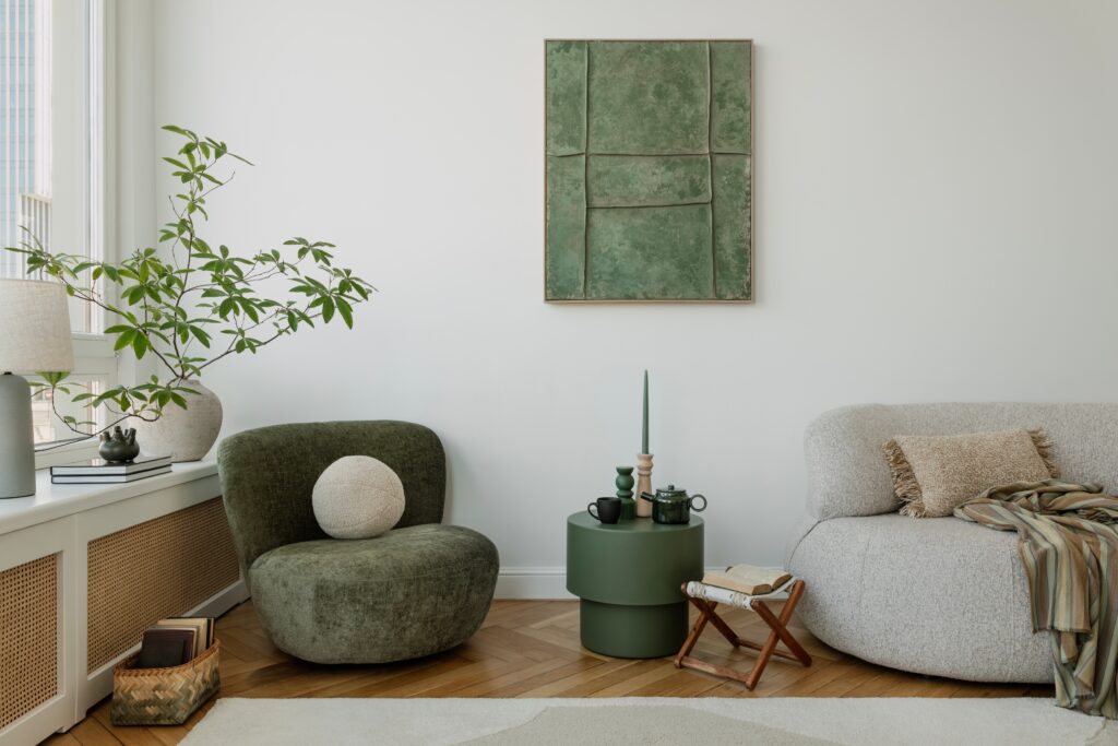
The 60-30-10 Rule: A Foolproof Formula
This classic interior design rule helps create visual balance:
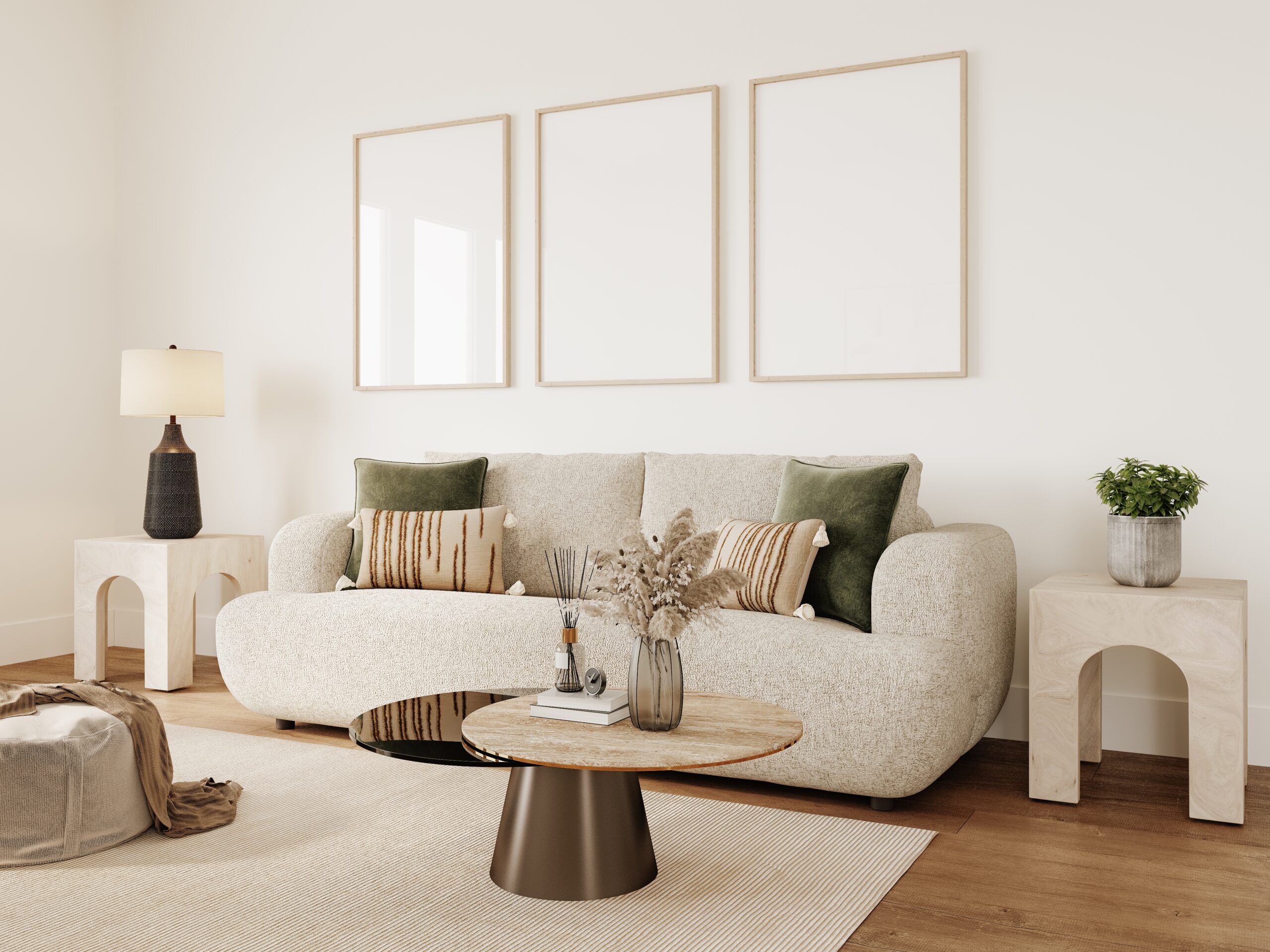
- 60% – Dominant colour (walls, large furniture, rugs)
- 30% – Secondary colour (curtains, accent chairs, cabinetry)
- 10% – Accent colour (pillows, art, vases, throws)
Example Palette:
- 60% Soft grey
- 30% Dusty blue
- 10% Brass/gold
| Element | Colour | Example |
|---|---|---|
| Walls & sofa | Soft grey | 60% |
| Curtains & chairs | Dusty blue | 30% |
| Lamps & frames | Brass/gold | 10% |
This creates balance without being boring. It also stops you from overcommitting to trendy colours.
Warm vs. Cool Tones: Understanding Undertones
Even neutrals have undertones. Misjudging them is one of the most common design mistakes.
- Warm tones = yellow, red, or orange undertones
- Cool tones = blue, green, or purple undertones
Before you commit:
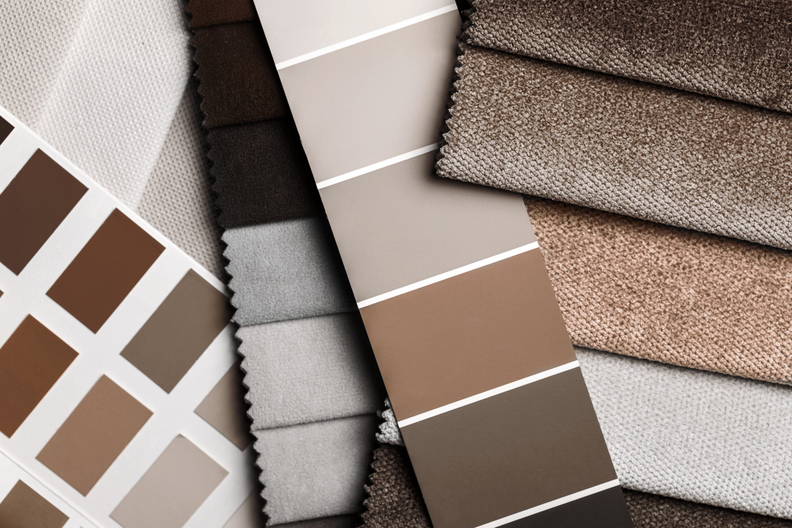
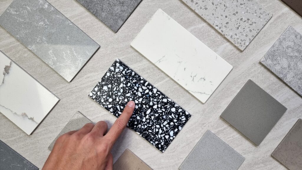
- Compare swatches in natural daylight and artificial light
- Place them near each other—warm and cool tones often clash
- Think about what already exists in your space (flooring, trim)
Pro Tip: Pair warm with warm, cool with cool—unless you’re very confident with contrast.
Choosing Neutrals That Aren’t Boring
Not all neutrals are created equal. Beige isn’t beige, and white has about 10,000 personalities.
Stylish Neutrals to Consider:
- Greige: Grey + beige = modern and versatile
- Warm white: Creamy and soft (ideal for cosy spaces)
- Cool grey: Sleek and elegant (great for minimalist homes)
- Charcoal: Dramatic, without feeling too black
- Olive or sage: Technically colour—but works like a neutral
Design Tip: Choose one hero neutral and let it lead the tone of your palette.
Creating Flow Between Rooms
Your home doesn’t need to be one big colour block—but the rooms should relate to each other.
How to Create Flow:
- Use one base neutral throughout (e.g. all walls soft white)
- Repeat the same accent colour in small ways in every room
- Choose tones from the same colour family (e.g. navy, slate, sky blue)
Walking through your home should feel like reading a chapter book—not jumping from genre to genre.
Accent Colours: How to Add Personality Without Chaos
Accent colours bring energy and individuality to your palette—but they work best when they’re strategic.
Best Practices:
- Use sparingly: 10–15% of your total scheme
- Echo in soft furnishings, art, flowers, tableware
- Change with the seasons: warm rust in autumn, lemon in spring
Popular Accent Colours:
- Emerald: Luxe and grounding
- Mustard yellow: Warm and retro
- Blush: Soft and sophisticated
- Teal: Bold but calming
- Terracotta: Earthy and stylish
Accent doesn’t mean loud. Even muted tones can “pop” against the right backdrop.
Tools and Tips for Testing Colours at Home
Before you buy gallons of paint or a new sofa, test your palette in real life.
Try:
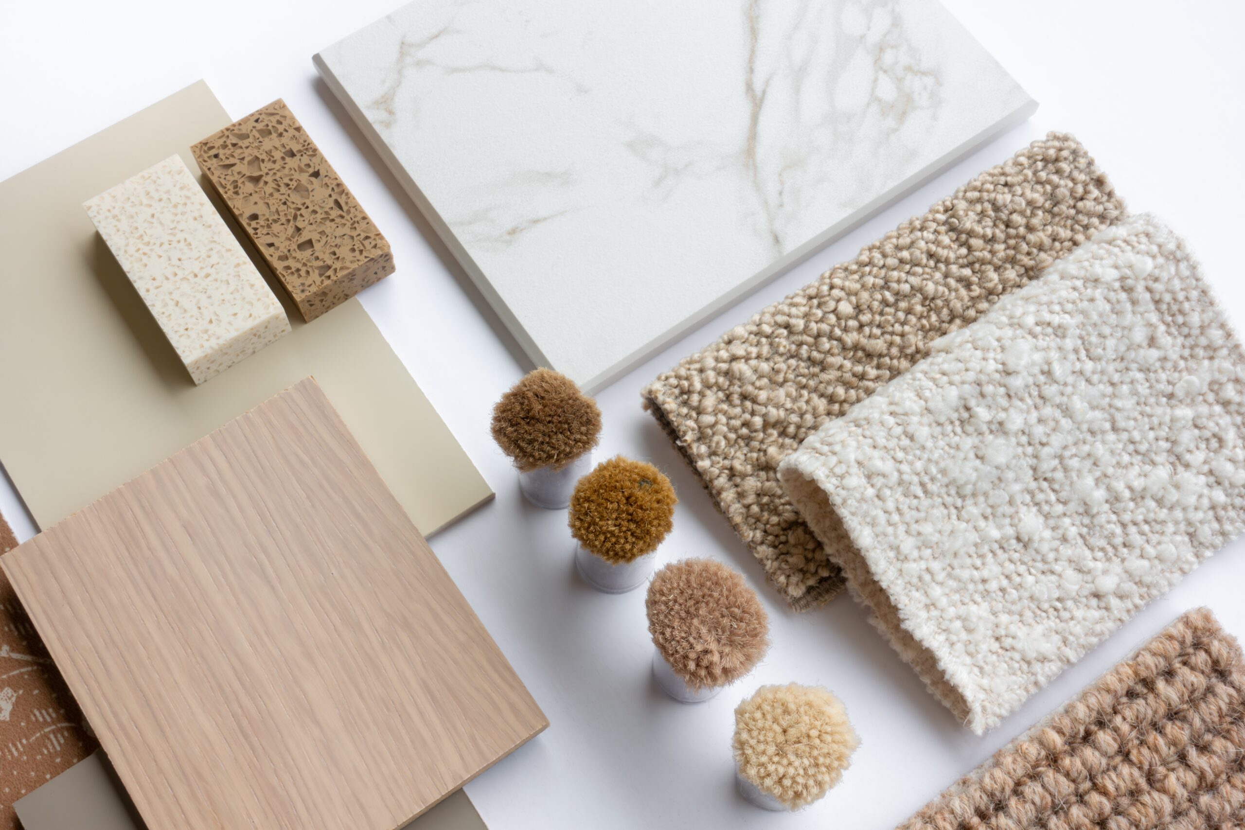
- Paint swatches on multiple walls (not just on white paper!)
- Order fabric swatches for upholstery and curtains
- Use online palette tools like Coolors, Canva, or Adobe Color
Test your palette with:
- Daylight vs. evening lighting
- Cool vs. warm bulbs
- Wood tones, floor colours, tiles, metals
Live with your samples for a week. What looks perfect in-store can feel off at home.
Final Thoughts: Your Palette, Your Rules
Design rules are useful—but your home should make you feel good.
Don’t be afraid to:
- Break the 60-30-10 rule
- Mix warm and cool tones intentionally
- Paint the ceiling your favourite colour
- Choose colours that spark joy, not approval
The most beautiful homes don’t always match—they resonate.
🔁 Coming Soon
- Room-by-Room Colour Palette Cheat Sheet
- How to Layer Pattern and Colour (Without Overwhelm)
- Moodboard Templates to Build Your Dream Colour Story
